A comparative chart analysis of bitcoin and blockchain data
I’m a fan of data and charts, and if there is one thing the bitcoin blockchain has, it’s a lot of data; so much so that it’s often a point of contention in the bitcoin community as people like to choose different data points to make an argument.
Often times looking at the data itself is one dimensional. With this in mind, I wanted to take some time and come up with some unique charts that capture data from the blockchain in a visual way from the past twelve months (January 2015-January 2016). Using this these charts, we can make casual observations of the data and how it behaves.
Comparing the average block size to the bitcoin price
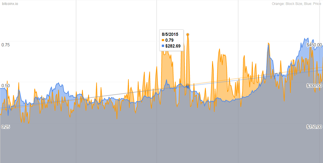
Charted above are the past twelve months of data of daily bitcoin transactions with the average block size per transaction compared against the price of bitcoin (in USD). The average block size is charted in orange, and the bitcoin price is in blue.
There appears to be a slight correlation between the two, with an increase in average transaction block size and the bitcoin price. During the summer of 2015 you can see an anomaly when bitcoin experienced a “spam attack” where someone was spamming the network and you can see a spike in the block size.
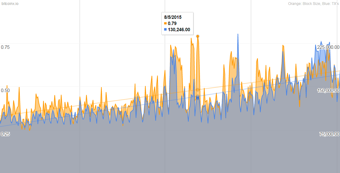
Comparing the average block size to the number of bitcoin transactions

In this chart, are the past twelve months of daily bitcoin transactions with the average block size per transaction compared against the number of bitcoin transactions per day. This chart more closely correlates to each other, having almost identical peaks.
Here as well you can see the network spam in the summer of 2015. A more obvious observation would be as there are more transactions, the bigger the average block size becomes. As bitcoin grows, block sizes will continue to grow.
Comparing the average block size to bitcoin transaction fees

Charted above are the past twelve months of daily bitcoin transactions with the average block size per transaction compared against each bitcoin transaction fee.
The comparison shows an increase in block size however more interestingly transaction fees stay flat. The variations in fees are subtle compared to the overall increase in average block size.
Comparing the bitcoin price against the number of bitcoin transactions
Charted above are the past twelve months of daily bitcoin transactions compared to the daily bitcoin price (in USD). This chart clearly shows the increase of transactions is closely related to the the increase in price.
However, as we know with the bitcoin price it’s unpredictable and even using past history it’s impossible to determine what it will be in the future.
Comparing the bitcoin market cap against the number of bitcoin transactions
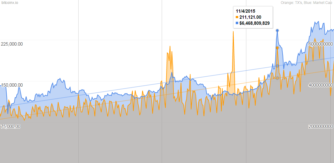
Charted above are the past twelve months of bitcoin transactions compared to the global bitcoin market cap, which started the 2015 year at $3.7B and started the 2016 year at $6.5B.
This chart behaves just like the bitcoin price comparison chart to the number of bitcoin transactions, except the linear trendline for the market capitalization continues to rise and isn’t as volatile as the bitcoin price is.
The data used in this article has been sourced from our charts data, with the exception to the bitcoin transaction fees data. The transaction fees data was sourced from Smartbit